Making the case for ScreenShooter – What should we be testing?
ScreenShooter is all about making sure that your web pages render properly with the configurations of device, operating system, browser and screen resolution that your biggest groups (cohorts) of users are using – how far you should go down the list depends on how many users you have and what the value to you is of optimising user experience for the more obscure configurations… the best approach is to start with the biggest group and work your way down – as ScreenShooter automates more of your testing for you – with the same amount of time you can get further down your list.
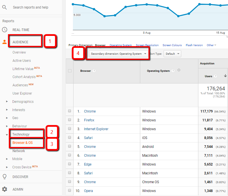
Google Analytics Default Reports
So what configuration are the biggest groups of users using? With Google Analytics you can get some insight into this with the default reports by going to: Audience > Technology > Browser and OS – your primary dimension will be set to Browser and you can set a secondary dimension of operating system or screen resolution for example.
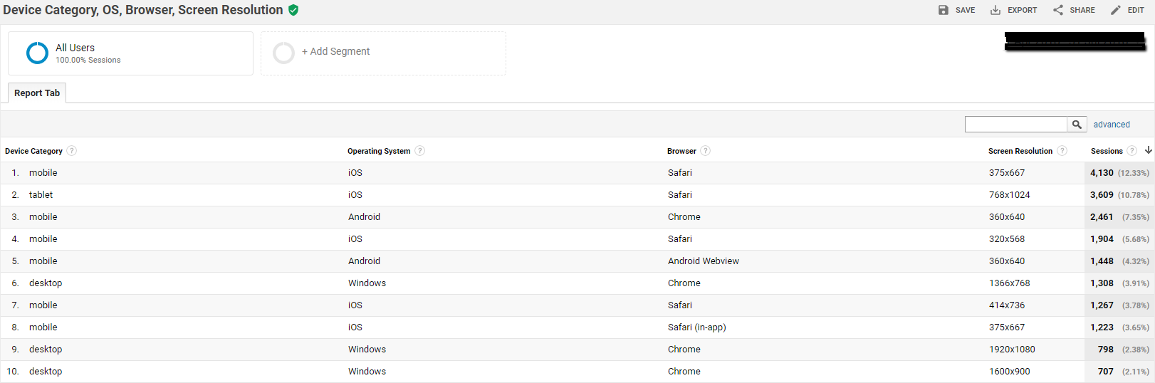
Sessions by Device Category, OS, Browser and Screen Resolution
But to properly work out what configurations you should be testing, you need more dimensions together – which means you need custom reports. (Before you get into making your own reports – there are two we’ve made for you available to import via links in this page) Customisation > Custom Reports > New Custom Report. Key dimensions are: Device Category, OS, Browser, Screen Resolution. Here’s a free custom Google Analytics report you can import just <span id=”how_to_import_custom_analytics_reports”>open the link in your browser while logged into analytics and select a view to import into – once you have the report – you can edit it and change under views from 1 selected to “all views associated with this account”</span>
This report will show you what you need to be testing. Depending on the volume of users that you have, you may need to use the control near the bottom right to determine the number of rows to show in the report.
Inferring Apple devices from Screen Resolutions
So we can see for the site being analysed above that Apple mobiles (row 1, 4, 7 and 8) and tablets (row 2) are the most used devices, followed by android mobiles, on android mobiles we have Chrome (row 3) but we also have the Android Webview system component (row 5), we have Chrome on Windows (row 6). This is a fairly typical profile for a UK based B2C site. We could infer which apple devices are in use by referring to https://www.paintcodeapp.com/news/ultimate-guide-to-iphone-resolutions and/or https://www.mydevice.io/#compare-devices (Look at the CSS width column)
So iphones at 375 x 667 (row 1 and 8) are iPhone 6, 6s, 7 and 8 – I would test using the iPhone 8 in portrait mode on ScreenShooter to test for row 1.
Apple tablets at 768 x 1024 (row 2) are Apple ipad Pro 9,7, Apple iPad 3,4,Air, Air2, Apple iPad 1,2, Apple iPad mini 2,3,4, Apple iPad mini in portrait mode. So you could use the Air 2 device in ScreenShooter to test this. There are many Android devices at 360 x 640 so we’ll refer to the second report (below) to work out which devices we should use to test, iPhones at 320 x 568 (row 4) are iPhone 5, 5S, 5c and SE. iPhones at 414 x 736 (row 7) are iPhone 6+ 6s+, 7+ and 8+ I would use the 8+ in ScreenShooter to test for example. Chrome at 1366 x 768 (row 6), 1920 x 1080 (row 9) and 1600 x 900 (row 10) are all easy to test with ScreenShooter (although unless your responsive layout really makes different use of larger screen resolutions you may find that all 3 are effectively the same).
Sessions by Device Category, OS, Browser, Resolution and Mobile Device Info
(Analysing your Androids!)
It’s helpful to add the mobile device info dimension but do bear in mind that only devices with device category mobile or tablet will have mobile device info so by adding this dimension you are filtering out all your desktop traffic – so to get clarity you need to combine the results from the custom report above with the results from this second report – don’t use this second report in isolation unless desktop is truly not just a diminishing medium for your target audience but already so diminished as to be irrelevant! (That’s not the case for most websites). Here’s another free custom Google Analytics report you can import to your Analytics (as above)
I prefer to add filters for Operating System = Android, Browser = Chrome and Screen Resolution is 360 x 640 to drill down into row 3 of the results shown in the first custom report above to work out what devices could be used for testing that test profile – obviously to test the whole cohort you need to test every device but you can make excellent progress by testing with the most popular devices. Here’s the custom Google Analytics report with the filer’s applied
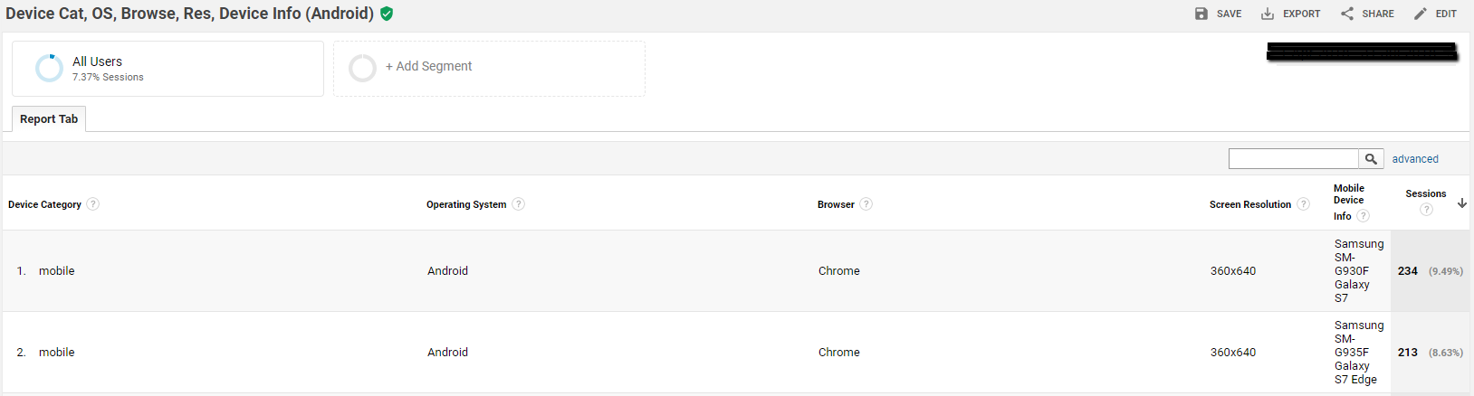
In the data above effectively we are breaking down row 3 in the first custom report so for Android testing, I would look to use the Galaxy S7 and S7 edge.
Conclusion
So in the case of the example website shown, by testing all our pages using ScreenShooter test profiles for:
- iPhone 8 portrait
- iPad Air 2 portrait
- iPhone 8+ portrait
- Samsung Galaxy S7
- Samsung Galaxy S7 Plus
- Chrome on Windows at 1366 x 768 and if it’s responsive template requires it then 1920 x 1080 and 1600 x 900
We will have made a good start towards testing 90% of users. But what’s important here rather than the conclusions about what we should test for this example UK based B2C website, is the methodology by which you can work out what you should test for your website audience.
Further thoughts
By using ScreenShooter
- we will find issues that real users will be seeing that we would not see if we used mobile emulation in Chrome or Firefox. Fixing these issues will improve conversions on your site and this should make this testing and fixing well worthwhile especially if you have a busy site that already has a reasonable conversion rate
- By establishing reference images, when we come to update our site, we will only need to check any pages where differences have occurred against our reference images which will save masses of human testing time.
p.s. I might be tempted to use ScreenShooter’s test profiles for
- iPhone X
- Samsung Galaxy S9 / S9+
as well for good measure – as these are likely to be growing cohorts with higher spending power!